Eurosport / Discovery Network
Research and design
In 2018-19, I was working with Eurosport product teams across web and app to improve their digital products by research and design and to bring users closer to the business.
👩💻
Design activities:
User research
Information architecture
Design strategy and workshops
Visual & interaction design
Developer support
Made in 🖌️ Sketch, Invision, MS Powerpoint and Excel
Supporting the design team with user research
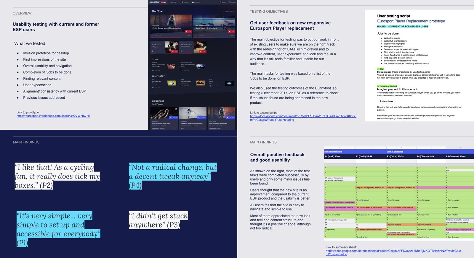
One of my main roles at Eurosport was to support my fellow designers with user testing. I collaborated with the research team (based in Paris) to recruit users from the Eurosport Voice panel for remote testing.
The main objective for testing was to put our work in front of existing users to make sure we are on the right track with the redesign and to improve content, user experience and look and feel in a way that still feels familiar and usable for our audience.
The main tasks for testing were based on a list of the ‘Jobs to be done’ on Eurosport Player.
We also used the testing outcomes of a previous lab testing as a reference to check if the issues found are being addressed in the new product.
My usual process was:
Building prototypes in Invision
Agree on objectives and goals for testing
Writing user testing script
Conduct testing
Analyse findings and play it back to the team with recommendations
Eurosport Player mobile app
I designed the core user journeys for the new Eurosport iOS app, using components from the new design system that we were building with my fellow designers and also creating new ones as required. I mainly contributed the sign in/sign up, subscribe and account area designs and components to the design system and other elements like card and widget variables specified for the app.
I designed the main screens in Sketch and built an interactive prototype in Invision for testing and to demonstrate the journeys and features to the mobile app team.
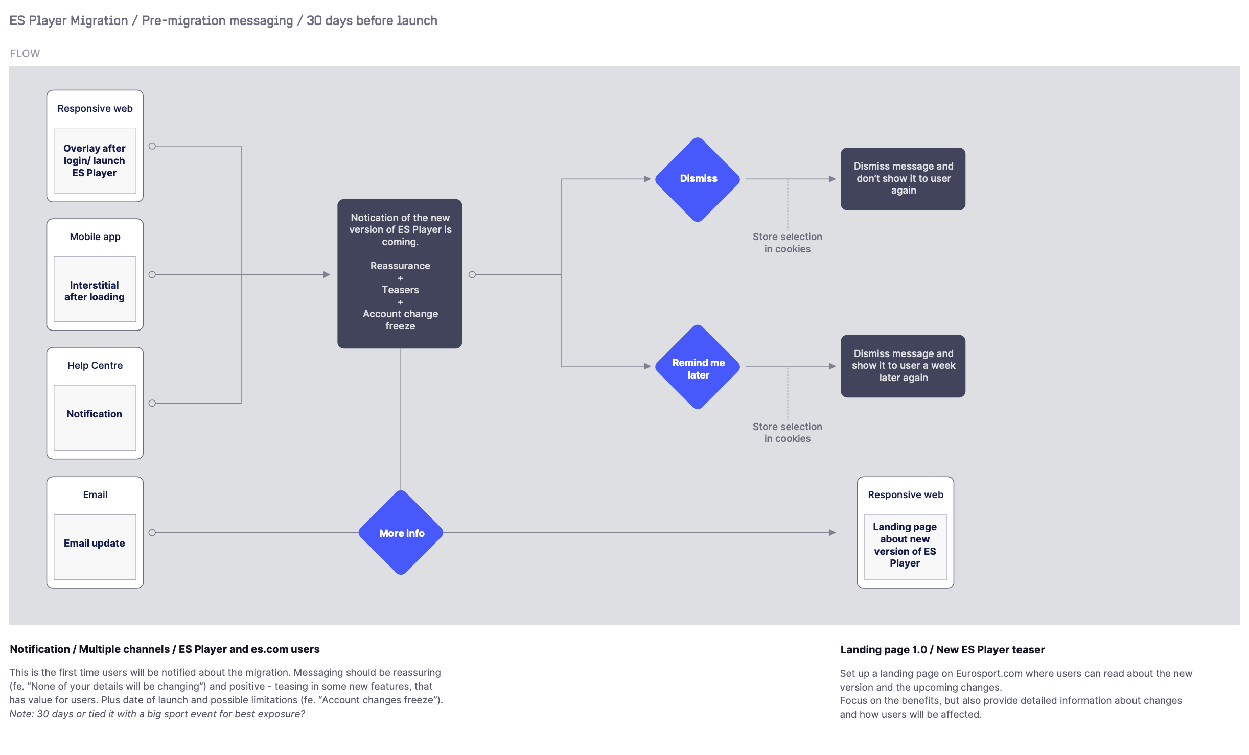
I was also helping the development with user flows, diagrams and documentation for the messaging about the Eurosport Player platform migration that Discovery went through at that time.
New CRM system and Help Centre for Eurosport
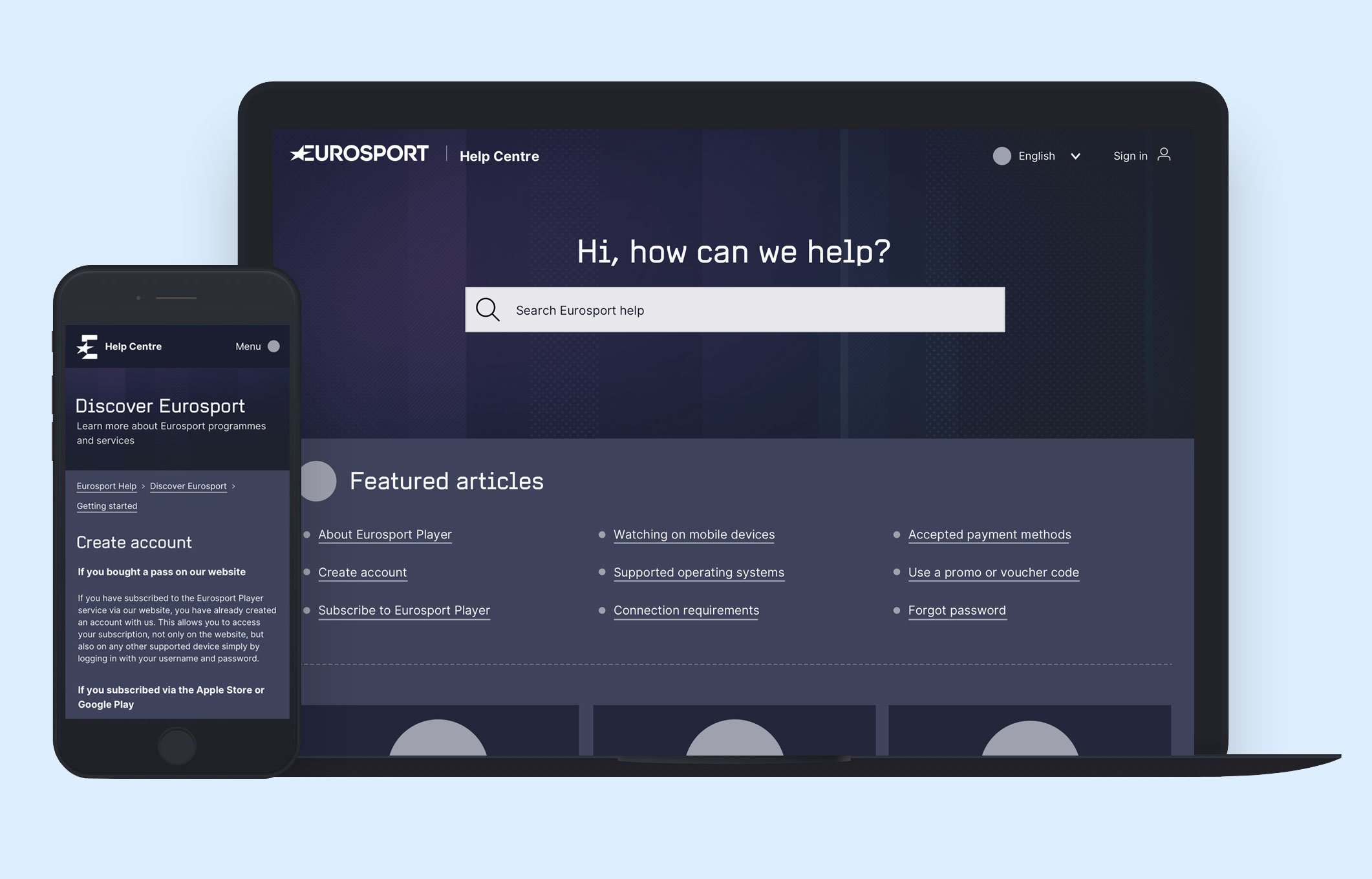
I was working closely with a product team and the Customer Service team to implement a new CRM system and Help Centre for Eurosport.com and Eurosport Player.
I facilitated multiple workshops with the Customer Service team, collaboratively working on the new Help and thinking about how to make it better for our customers. We talked about requirements, priorities, roadmaps, design, content and architecture.
I also worked out a new categorisation and structure for help articles based on typical user actions and validated it with users. I set up a card sorting study on OptimalSort with 30 cards and asked Eurosport Player customers to do the exercise.
We had a short discovery phase with the development team to understand how Zendesk (our new CRM platform) works and what its capabilities are and I checked out the current best practices for help centres and how other big brands set up their help section on Zendesk’s platform. Based on all the findings and work done, I created the journeys and wireframes for the new Help Centre.
My approach was to create a journey that was clean, engaging and intuitive for our users, so they can easily digest content as well as navigate the UI.


