Compare the market (2013)
Research, design and delivery
Bespoke broadband, home phone and digital TV white label for one of the three largest price comparison websites in the UK.
I carried this project from the initial pitching phase to product launch and through the iterative process of multiple small releases to improve conversion rates. I was working with our ecommerce team, internal and external stakeholders on the concepts and with multiple Scrum teams on development.

👩💻
Design activities
Information architecture
User journeys, user flows
Visual & Interaction design
Stakeholder management
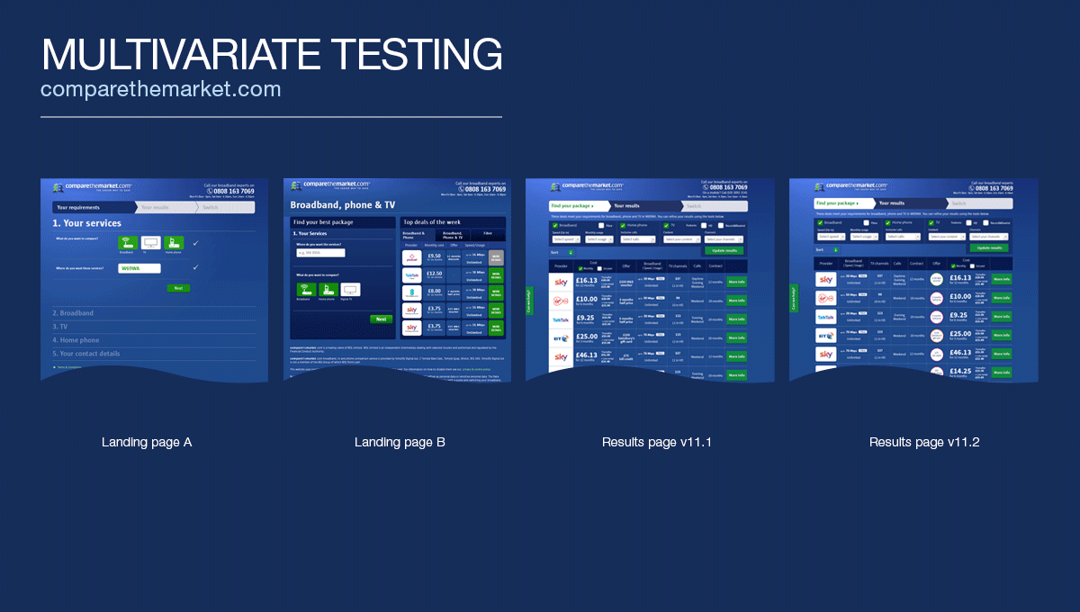
A/B and multivariate testing
Made in 🖌️ Adobe Photoshop
Initial phase
First we were pitching concepts and ideas on a tender to become the new partner of Comparethemarket.com for their broadband and digital tv white label.
The challenge was how to offer the same brand and user experience for this vertical on the comparethemarket.com website, and how can we enable users to flow freely between different products while our white label feels natural and consistent.
We identified the key points and elements of the existing user journeys, then looked at how we should translate our product in terms of architecture and user flows to align with those. We also investigated how we can include our strong offline proposition (UK based call centre) in the journeys.
(We worked with visual designs and not wireframes from the start as high fidelity was needed for the pitching documents and process.)

After we successfully made it to the second round, we improved the journeys, added new steps and looked at how we can integrate our CRM to offer online checkout, which was a unique proposition on the market. We also included initial mobile concepts.

First releases
We successfully won the pitch and started to work closely with comparethemarket.com to release our first MVP. We improved the journeys and made them simpler by cutting out any unnecessary steps and clutter. The designs were constantly tested by comparethemarket.com’s internal research team and the findings were fed back to us.
We also got access to the brand guides, so I made sure that everything is aligned in the designs and interactions.
After launching our MVP product, we continued to work on the pages and made iterative improvements based on analytics data, feedbacks and new ideas. These improvements were released on a bi-monthly basis.

Iterations
After the first trial months and initial performance reports, we started looking at how to improve conversion rates. We built in new features, updated the interface, started A/B testing, then partnered with Maximiser for multivariate testing to see which improvement makes the biggest impact on sales. This way we improved online conversion rates by 2.3% over a few months.
'Finished' product
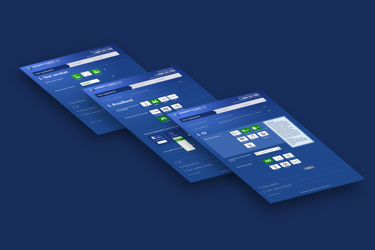
We delivered the first version of the product in 10 weeks working in Agile development for the initial launch in October 2013. Later on we had additional sprints to release improvements. These screens below reflects the state of the site in the third quarter of 2014.


💮 Home